


i hate spring shopping
confessions of a warm autumn girl & how to shop smart when seasonal colors have a personal vendetta against you

Nothing dulls my spirit more than walking into a store, eyes all aglow, ready to shop, and seeing… THIS:
*Psycho main theme plays*


Pale (Alaskan Bull Worm) pinks, butter yellows, pastel shades, and florals as far as the eye can see. This is hell. This is… the state of spring shopping every single year.
Spring always comes at the perfect time —when I’m completely fed up with winter, sick of wearing pants, and ready to embrace a new season of fashion. And yet, I am met with countless unflattering colorways staring back at me, begging me to ignore my own personal color wheel. Not to mention, I’m genuinely not a fan of florals unless it’s a dark 90s grunge-esque print or extremely literal/campy like Tyler McGillivary.
As a self-proclaimed (I did my own color analysis) Warm Autumn, spring is the hardest time for me to buy new clothes, because pastels are not my friend. I can think of no worse combo than an olive skin tone + the pale yellow suit Timothee Chalamet wore to the Oscars.
Let’s just say if I wore any of the looks Ariana Grande wore on the Wicked press tour/awards show circuit, I would be rushed to the hospital by way of “suspected liver disease.” The only thing I’d be serving is #jaundice.

[If you don’t know your color season, I highly recommend figuring it out—whether through a professional analysis or by exploring free resources online. To avoid the $300+ price tag, the internet offers a plethora of guides to help you determine what works best. For me, knowing which colors to avoid has been a game-changer, making it easier to curate my wardrobe and resist buying pieces just because they look good on the rack.
For entertainment, please watch this video of Robert Pattinson getting his color analysis for the Mickey 17 press tour.]
While color analysis had a major moment in fashion last year (and for good reason), it’s more than just a trend. Understanding (scientifically) what flatters you is a powerful tool for mindful shopping, curating a wardrobe you love, and making more intentional purchases.
Of course, just about everyone experiences a time of the year in which the antithesis of their color season is THE trending palette. I do not claim to be unique in this way. I do wish to normalize the idea of wearing what we want (when we want) and not always succumbing to seasonal trends, palettes, and colors that are “in” at a given moment.
So, what do you do when a gorgeous new arrival only comes in shades that make all who see you want to gouge their eyes out with a spoon?
Honestly, it’s not that deep—but it is annoying. Sometimes, I walk into a store, take one look at the color selection, and immediately want to turn around. But before you give up, there are some easy ways to work around seasonal color trends and find an emerald needle in a sea foam haystack.
Here’s how to make shopping feel less like a personal attack on your wardrobe and more like a fun (and successful) hunt for what works… without hassle.
[Disclaimer: None of the recommendations below are affiliate links or paid partnerships with any brand —just genuine suggestions!]

it’s critical. is currently free for everyone. It’s a labor of love, and it takes a lot of time to research specific topics… SOOO, if you’re a fan of the newsletter or my silly little ramblings, consider supporting for just $5 a month or just $40 a year.
I’ll be introducing more paywall content this year, so if you’d like access to those future newsletters, become a paid sub, & join the Critic’s Circle. XOXO

1. Online shopping for colors that work
Oftentimes (like the NSFW pictures I included at the beginning of this newsletter), brick-and-mortar stores exasperate the issue by dressing up the floor with a nauseating amount of seasonal pieces.
They like to show everyone that it’s a new season with new arrivals that are eu so on-trend —which is understandable only when it’s pieces I look good in. It’s rude to leave me out, okay.
Retailers stock a much wider range of colors and styles on their websites, even if their physical stores are drowning in “the bad stuff.” You may have to do a little bit of digging to get past the spring-y collection (or whatever season you’re avoiding) —but inventory runs deep, so you’ll most likely be able to find colors that fit your vibe by doing a specific color search.
For example, this is the first thing that pops up on the J.Crew page… not my speed. I want dark colors.
But, when I search “red” I get 8 pages of true, cherry red pieces that are hiding in the shadows (and luckily, on sale).


2. Shop brands that offer year-round neutrals & classics
Not all stores strictly follow seasonal color trends for the majority of their new collections. You can always go with tried-and-true brands that consistently stock neutrals, earth tones, or deep hues —spring styles in not-so-spring colors.
Here is a list of some brands that aren’t strictly operating on an Easter Sunday agenda:
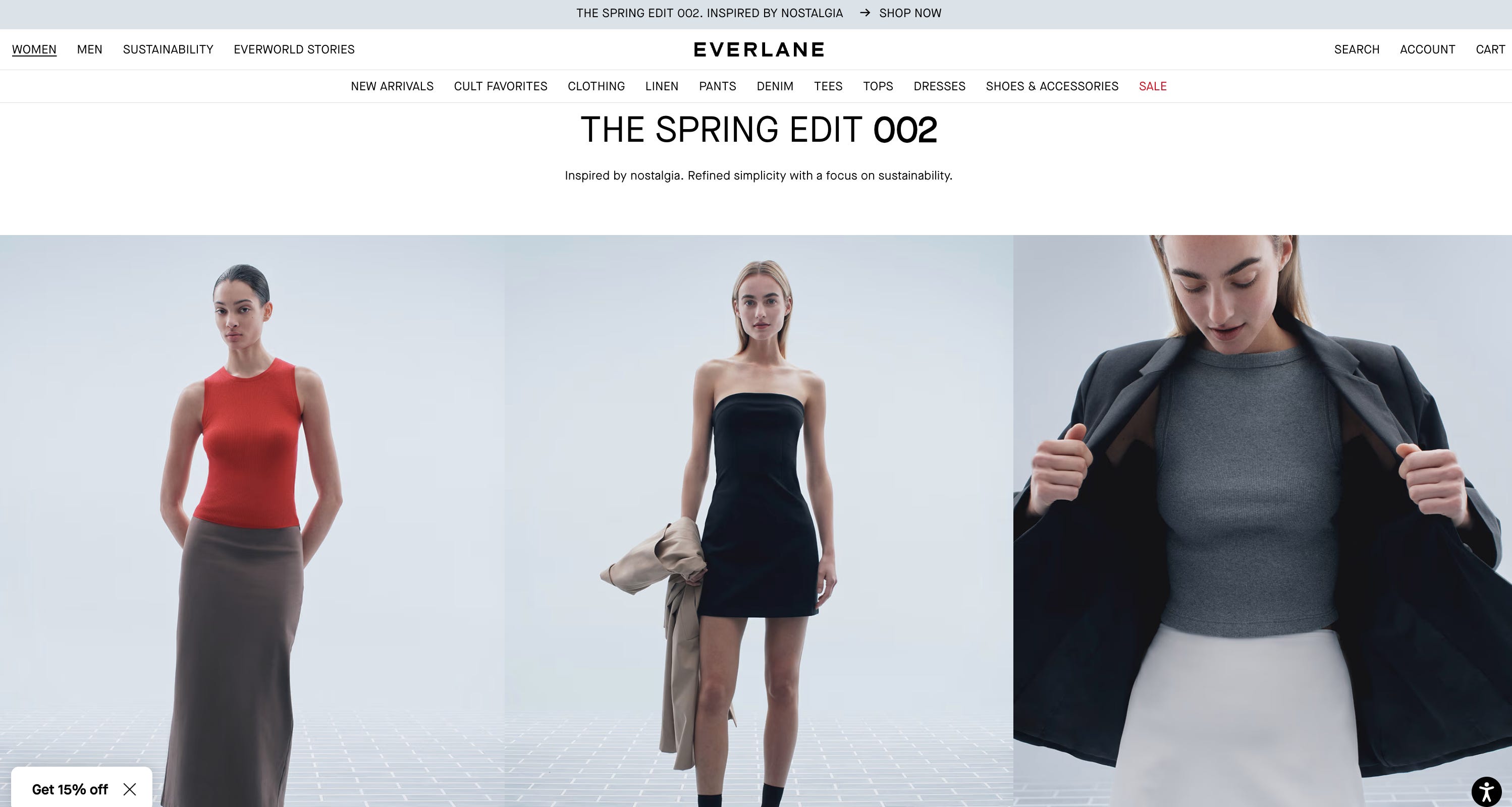
Everlane
Everlane’s Spring Collection is full of 90s minimalism + neutrals —definitely not your average spring pieces.
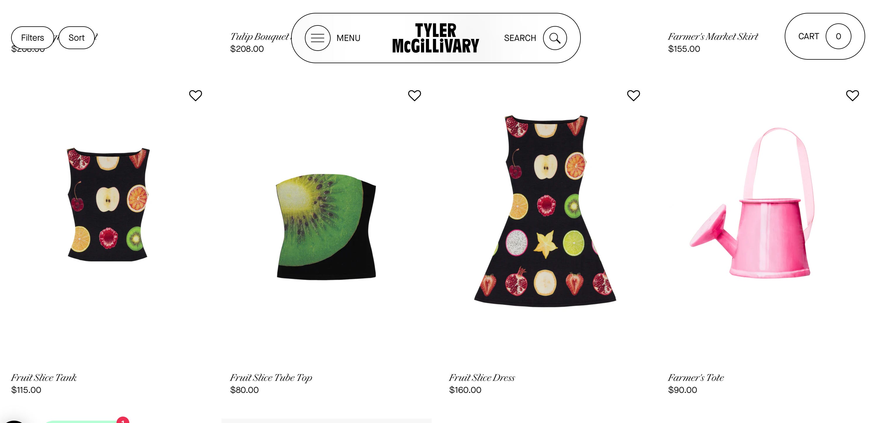
Tyler McGillivary
If you missed my newsletter on TMG’s first runway show, I urge you to take a look, if you’re not familiar with the brand. I particularly love them, because they don’t fit into the stereotypical conventions of creating “basic” nature-inspired clothing.
They are extremely literal in a campy sense, which makes their spring collection ridiculously fun, filled with colors that suit everyone’s needs, and perfect no matter your taste —incorporating lesser-used spring associations to create unique pieces (like teapots, obscure fruit, natural greenery, farmers markets, and antique vases).
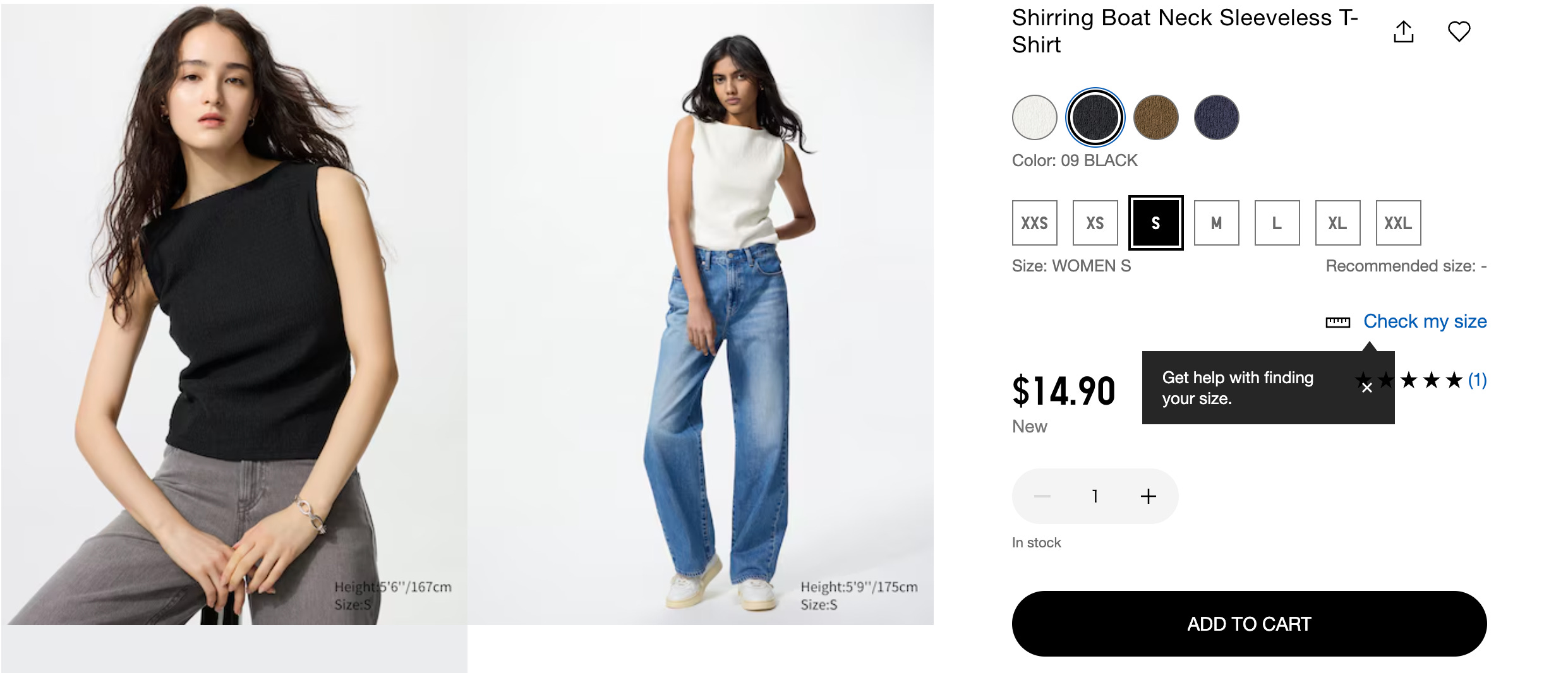
Uniqlo
Uniqlo is always serving post-apocalyptic style neutrals no matter the season.
I actually just ordered 3 of these Boat Neck Sleeveless Tops in black, white, and brown. I figured they’d be the perfect lightweight top for when it’s particularly hot outside.
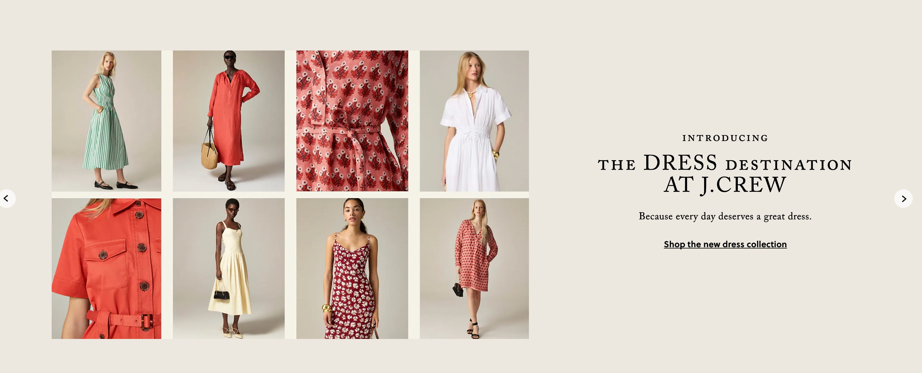
J.Crew
Obviously, I just mentioned J.Crew, but I need to give them their own section for successfully coaxing me into buying a couple of their pieces in-store. The sales associate was NOT playing when she brought me every single red piece they had…
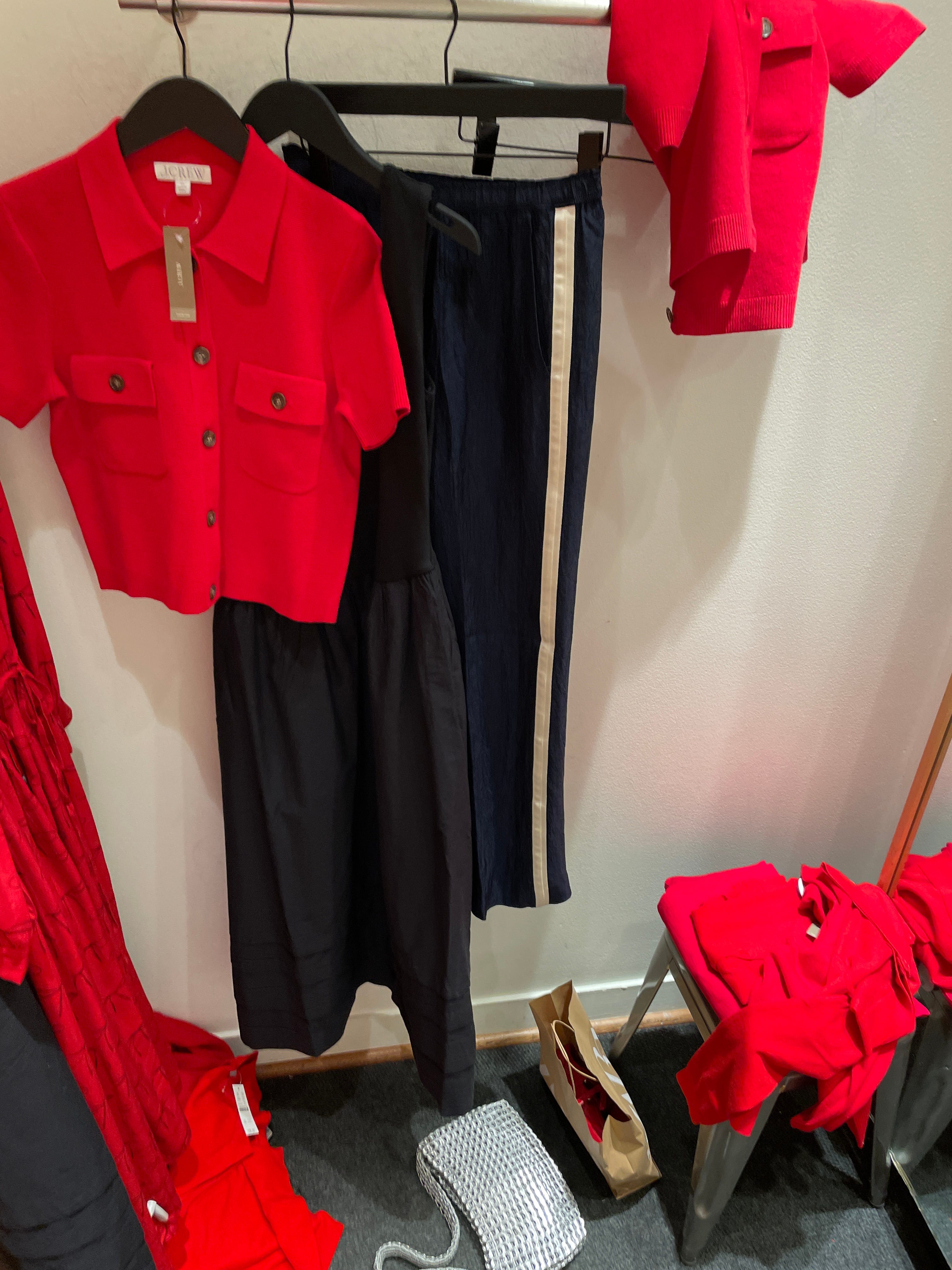
I was pleasantly surprised with their selection —not a whole lot of pastels, plenty of true reds, lightweight pants in dark colors, and poofy dresses made for chic wedding guests (not Piper Ratliff).
My favorite spring piece that comes in many interesting colors would have to be the famous Stratus Pants. I didn’t end up buying them, because I’m a cheapster, BUT I did try them on. The fit is so immaculate that I may go back and buy them in black. 10/10 would recommend (if you’re on the fence).
Another annoyance that comes with spring shopping (I forgot to mention) is finding appropriate wedding guest dresses that aren’t spring adjacent. I like something simple, dark, and particularly chic. I picked up this black, drop waist number, and I’m obsessed. It also comes in white and peach (if you ARE a spring girl).
")
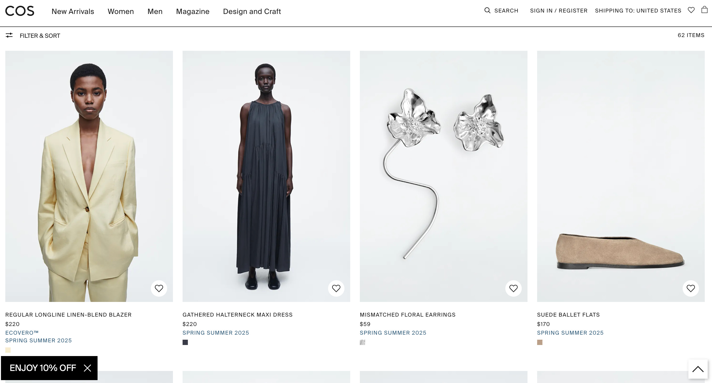
COS
While COS is certainly having a butter-yellow moment, their SS25 collection mostly consists of neutrals, blacks, and organic-shaped silver jewelry —spring vibes without an overload of pale hues. The styles are lightweight, linen, and perfectly encapsulate spring.

3. Check off-season sales or the clearance rack
One of the best-kept secrets? The clearance rack. I know it’s unglamorous, but saving money AND getting exactly what you want is the best feeling.
While stores push their latest seasonal arrivals up front, the sale section is where you can find hidden gems in colors that may actually suit you. Winter collections, for example, sometimes have the perfect little lightweight sweaters, cardigans, or versatile pants that easily transition into spring—without the soft tones.
Plus, shopping off-season can score you quality pieces at a discount, all while avoiding the frustration of trend-driven color palettes. A quick browse of the sale section might just lead you to exactly what you wished was in the new arrivals.


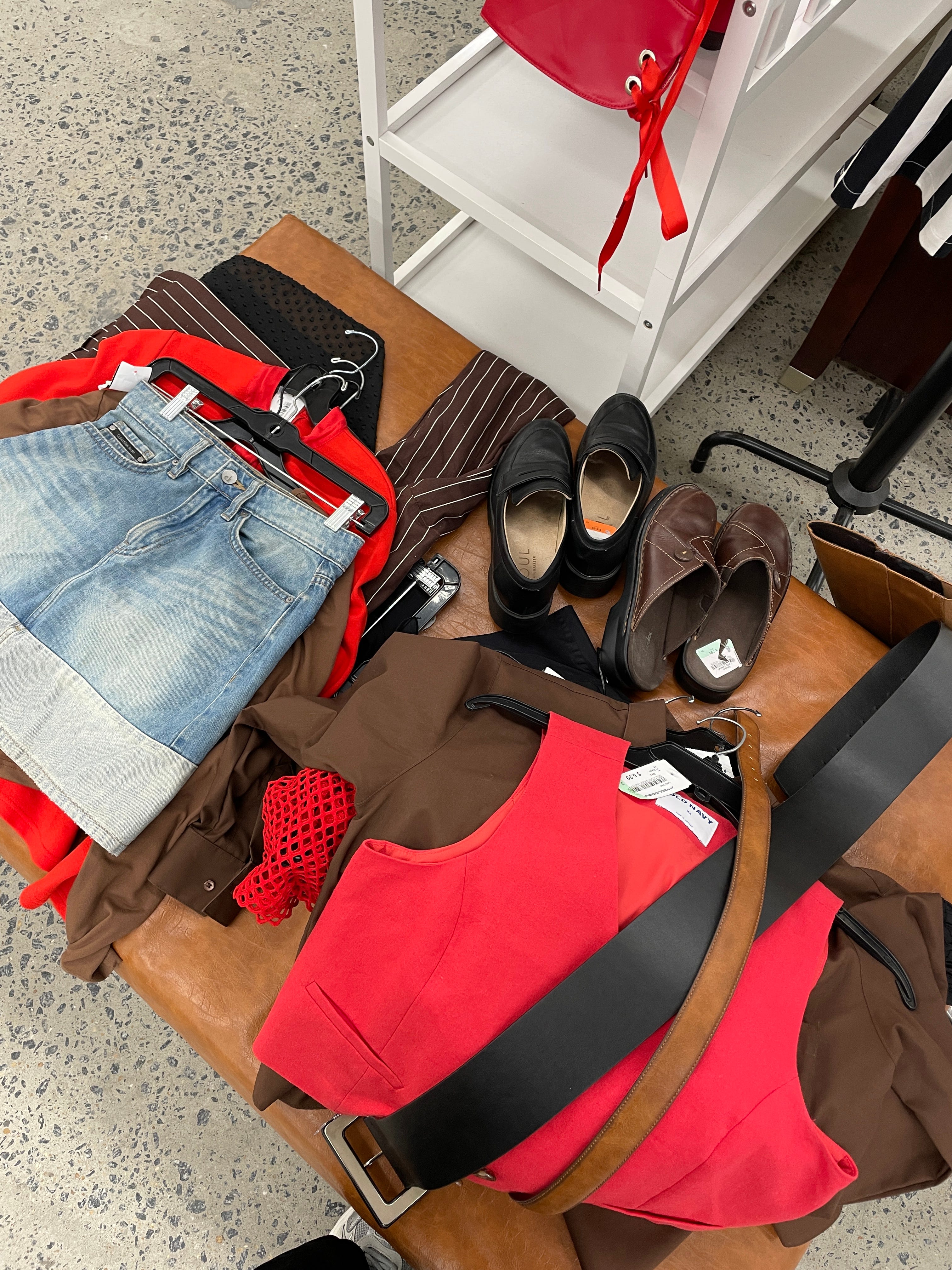
4. Thrift your way around the trend cycle
Thrifting is the ultimate hack for steering clear of the seasonal trend cycle —the world is truly your oyster. Instead of sifting through racks of this season’s "must-have" shades, you get a much broader selection—including plenty of colors that actually work for you. Bonus points if the store is organized by color!!
I had a fruitful thrifting experience last week that solidified my spring color palette as red + brown. I believe this was a sign from the fashion gods, so who am I to stray from the prophecy?
[More to come on this in a future letter… stay tuned.]
Trips like this can inspire you to get out of your comfort zone and find the spring palette that suits you better than the idea “big spring” is trying to sell you.

5. If you hate it… dye it
Say you found the perfect tank, but it only comes in pale hues. Guess what? We have TECHNOLOGY… or you know, the ancient technique of dyeing a garment a different color of your choosing. It’s so simple, but we often forget that we can very easily personalize clothing without having to be a textile wizard or a master seamstress.
I’ve used the brand Rit for dyeing clothing in the past and it’s worked pretty well. I’ve also heard that people enjoy Dharma Trading Co. and Jacquard. Each brand has online resources and step-by-step guides to help you achieve your desired look.


6. Use seasonal hues as POPS of color
So, you’re a fan of butter yellow…but it looks terrible on you. Loophole? Don’t make it the absolute focal point of your outfit. You simply do not have to drown in it.

So, a shade doesn’t suit you…you don’t have to give up on it for all eternity. You can use accessories (bags, scarves, accessories, ties, etc.) to add little pops of pastels to a neutral fit if you just can’t stay away.


7. Create your own seasonal trends
If you have a signature style and know what you like, don’t let the mass market tell you (or sell you) otherwise.
I’m embarrassed to admit how many times the seasons have rolled around, and I’ve acquired amnesia, forgetting that carnation pink is not a color I should put on my body. The seasonal fashion economy does a fantastic job of selling “fresh” colorways by way of “Remember this color? You haven’t seen this in a while. So fun!”
And guess what? The amnesia clothes are always the first ones to go during a closet clean-out.
But I am here to remind you that growth is possible. Now, aware of my pointless purchases of seasons past, it’s a fun experiment to develop my own palettes because fashion is deeply personal.
Here are some palettes I’m trying out this season that are certainly not stereotypical spring colors:
All-American Sailor Neutrals

Anti-Brat Pack
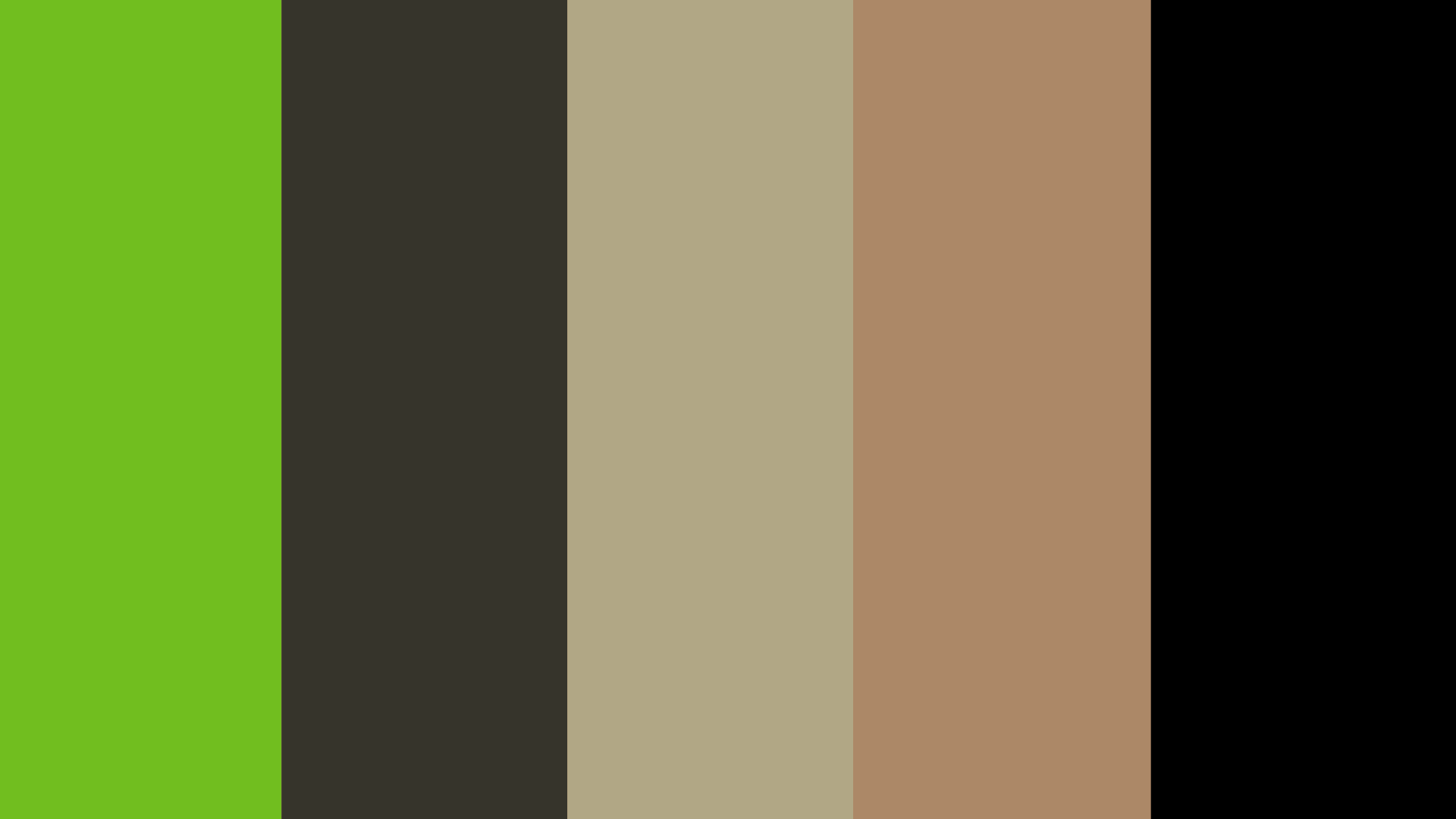
Chocolate Cherry Soda

Cobalt Cruella


I hope this letter inspires you in some way —whether to shop more intentionally, craft your own spring narrative, or even complain about seasonal shopping just as much as I do (I’ll never stop).
Feel free to comment, share, like or even subscribe if you found this the LEAST bit interesting. Until next time, stay critical.

Bravo bravo on this!! I haven’t had my colors done BUT I don’t feel great in pastels (which probably says something about my season) so this was great to read. My favorite of your tricks is to dye clothes the colors that you like best AND just buying black all the time 🤣
I love spring shopping so much