


Who's Merch Are You Voting For?
Dissecting today's political fashion and deciding America's future one baseball cap at a time.

[This post is (arguably) way too long. To read the entire newsletter, open in the app or browser.]
It’s election season… which means:
Being bombarded with insane political text messages (some highly entertaining)
Someone in your family is pushing their embarrassing cult-like political agenda on Facebook (eek)
Candidates are trying to be “cool” online to connect with Gen Z voters
Personally, I could care less if the President of the United States (their social media manager) understands the philosophy of Brat Summer.
But, I do know what a KHive means now, thanks to the NYT Mini Crossword.

Anyway, what I genuinely care about is if they have good merch. Call me shallow, but political merch has been a staple in American presidential campaigns for almost 200 years and I won’t let it fall by the wayside now.
Let’s take a short trip down memory lane. It only makes sense that I’m distantly related to the man who ran the first active campaign for the presidency, complete with slogans, catchy songs, and of course, merch.
Old Tippecanoe AKA William Henry Harrison and his VP pick John Tyler led the ever-popular “Log Cabin and Hard Cider Campaign of 1840.” Not the iconography I would have gone wild for, but hey, they wouldn’t have let me vote anyway!
If we’ve learned one thing from this campaign, it’s that 184 years later, men still love wood and alcohol. They’re nothing if not consistent.
Harrison and Tyler had all kinds of sick merch like engraved buttons, medals, teacups, and even oil lamps shaped like log cabins. Not a Stanley Cup in sight. People living in the moment and going insane over humble wooden homes.

The campaign merchandise of the late 1800s and early 1900s was more practical and less fashion-forward, understandably. What was missing? A women’s touch, of course. However, this Teddy Roosevelt bandana from 1912 might just put Hermes scarves to shame. Just saying. They popped off with this one.

It’s no coincidence that when women finally got the right to vote in 1920, campaign merchandise became fun, extra, and sometimes a full-body statement. Instead of just the classic pin or ribbon, we started seeing fans with faces, jeweled compact mirrors (thank you Calvin Coolidge), and even mini dresses.
The Nixon paper dresses of 1968 are some of my favorite political pieces. If I could get my hands on one today, I would wear it in a heartbeat and hope to God it didn’t rain… because these things cost a pretty penny on resale sites.

Back to 2024: What Does Campaign Fashion Look Like?
The last time I saw political attire running rampant in the wild was when Bernie Sanders took the world by storm in 2020. His fiercely loyal supporters weren’t afraid to #feelthebern in public. I know that the MAGA hat craze has certainly been a thing for a while, but even living in Georgia for the past… my whole life, I rarely ever see them. And I’m definitely THAT person who does a double-take on anyone wearing a red hat to “check” if it’s a MAGA one.
I’m no political correspondent for Vogue or anything (that’s a job for a Kennedy), but my observation is that the political climate has become so polarized that real people are embarrassed to publically support/express their admiration for a candidate via clothing unless they’re among knowingly liked-minded individuals, like at the RNC and DNC.
Does it stem from a fear of public backlash? Judgment from peers? Maybe it’s the fact that modern politicians aren’t inspiring enough to warrant pure fandom from everyday voters. Perhaps modern politics is steered toward passion for specific policies and agendas, rather than the figureheads themselves. People feel more comfortable supporting individual causes, rather than completely publically aligning themselves with one person.
Political Fashion: Deranged or Charming?
Because politics can be polarizing (shocker!), I’m prefacing this portion of the newsletter by saying: These fashion reviews are subjective. My opinion on the clothing, merch, and overall fashion does not reflect my political views. I’m taking that completely out of the mix and viewing it from a strictly third-party perspective (pun intended). Everyone is a target for style praise and scrutiny all the same, and that’s a beautiful thing.
In July, the RNC saw some pretty insane fashion. From bedazzled cowboy hats, and custom-made MAGA gowns (yes, there were more than one) to elephant beanie babies being attached to hats and brick wall suits, there was no shortage of “patriotism" personified.
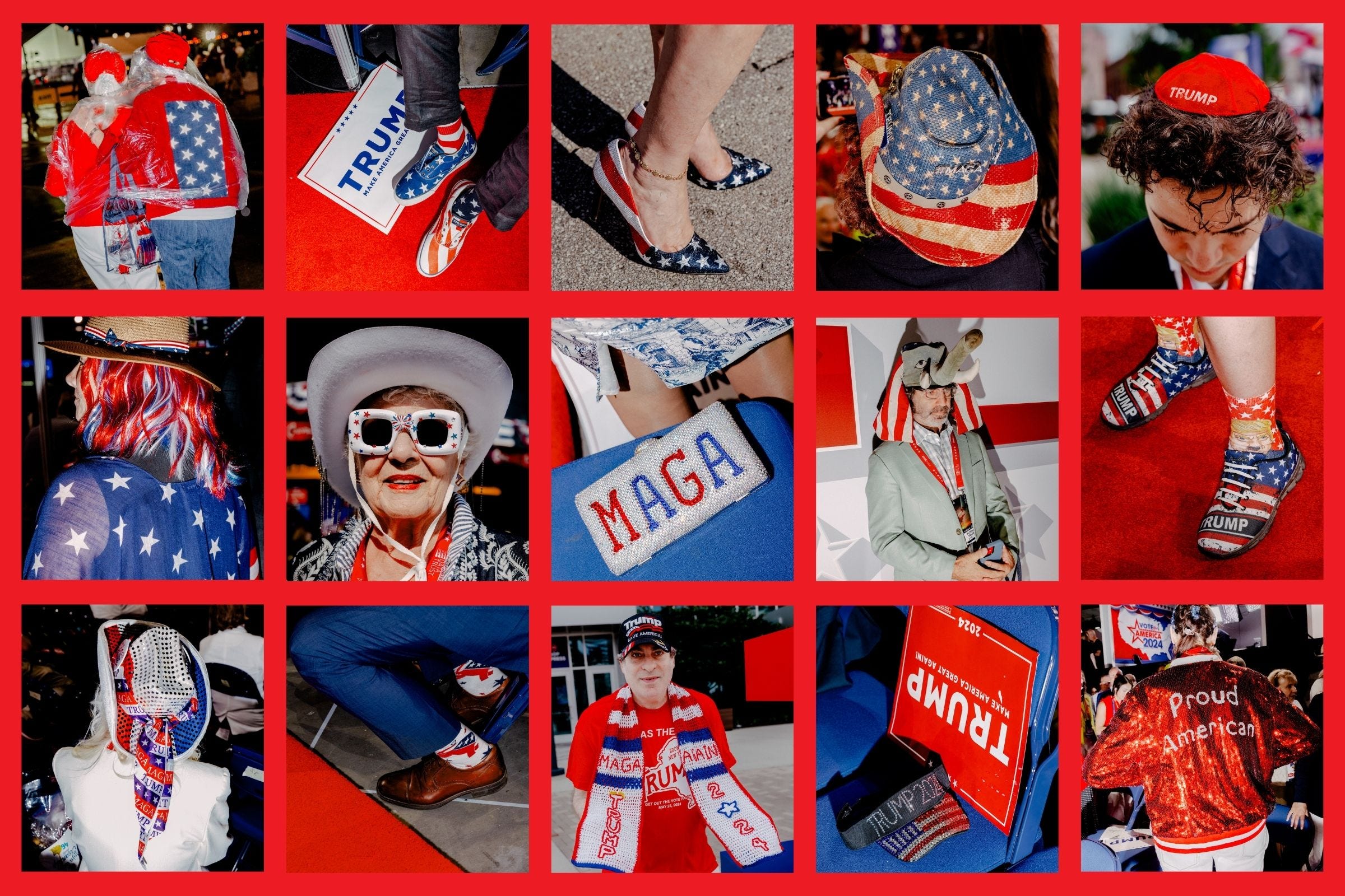
The question is, was RNC fashion deranged or charming? While most of these donned garments were incredibly loud and… dare I say eyesore-ish, there is something to be said about the communal craftiness. The RNC honestly delivered on entertaining me with campy, tacky, insane fashion that I haven’t witnessed anywhere else. The effort was there and I was not disappointed. If Met Gala attendees put this kind of effort into their looks, I wouldn’t be pulling my hair out year after year. Just saying.
This dress, however, is the ugliest thing I’ve ever seen in my life. This might be the single worst font to ever consider using on a piece of clothing and although the entire thing is garish, it’s the word “vote” that boils my blood the most. The colon also puzzles me, but there’s no point in trying to dissect why this happened. All that matters is that it did. And I’ll never be the same (derogatory).

After the “in your face” displays at the RNC… I couldn’t help but wonder: Would the DNC #serve in the same way?
Answer? They came to play. The DNC brought campy charm to their respective convention in a similar way, which I was happy to see. Something I noticed was that the DNC fashion was ever so slightly toned down in a way that read as fun but not AS visually grating as the RNC.
Why? Color psychology.
Republicans have red as their signature color, while Democrats have blue. Red, white, and blue prints, patterns, and accessories were present at each convention, but RNC fashion was predominantly red with blue sprinkled in, and DNC fashion was the opposite.

Blue is a color that makes us feel a sense of calm and peace. It represents trustworthiness and dependability. Red, on the other hand, provokes the strongest emotions of any color — from danger and warning to excitement, energy, and dominance. An overload of red tends to be offputting and stressful to most people, which is why RNC fashion as a whole may come across as less palatable than DNC fashion.
Did the Republicans get the short end of the color theory stick? Or does this color work best for “breaking through the noise” with loud political statements?
While I think the RNC had more entertaining fashion as a whole, the DNC had WAY better hats. It was giving Kentucky Derby but if Kamala was everyone’s favorite horse they were fangirling over… which actually would be a hilariously fun idea for the derby.


There was no shortage of insane cowboy hats either. Bedazzled, pink, sequined, embroidered, etc. Absolutely fabulous.
My biggest gripe with the DNC attire was all the Taylor Swift-related fashion. I guess she’s the new face of the Democratic party, since she’s an “unmarried, childless cat-lady,” according to JD Vance. I found the integration of her completely stupid, strange, and unnecessary, especially since Taylor Swift famously does not use her platform to advocate for… really anything at all, other than self-promotion.
I always enjoy a handmade friendship bracelet. The political ones are cute, but I could do without the Taylor Swift narrative associated with them. I completely understand the cultural impact of her tour and how it skyrocketed the friendship bracelet trend again, but I think this could have been carried over without explicit mention of her, all things considered.

So, if the National Convention was the Met Gala… who would win? I have to give this one to the Republicans. There were far more spectacles (for better or for worse), inspired handmade merch, and interesting displays of party loyalty.
Official Election Merch: Who Does It Better?
Now, it’s time to dissect the official election merchandise associated with each candidate. I’ll be critiquing pieces being sold in their online stores to determine (from a fashion POV), who has the superior merch.
Donald Trump Merch: Lazy or Ironic or Iconic?
Naturally, I can’t address Trump merch without discussing the infamous MAGA hat.
Love it or hate it, it’s brilliant branding. Polarizing, yes. But when is the last time a hat has engrained itself into American culture the way the MAGA hat has? When was the last time a piece of political clothing has stirred up this much buzz…and for years now?
GQ published a great article about the impact of the MAGA hat back in 2019. Highly recommend checking that out, because they break it down better than I ever could.

Red trucker hats and ballcaps will never be looked at the same. Trump supporters embrace it and haters make their own versions of it. The design itself has basically transcended right-wing politics and become a political statement for both sides.
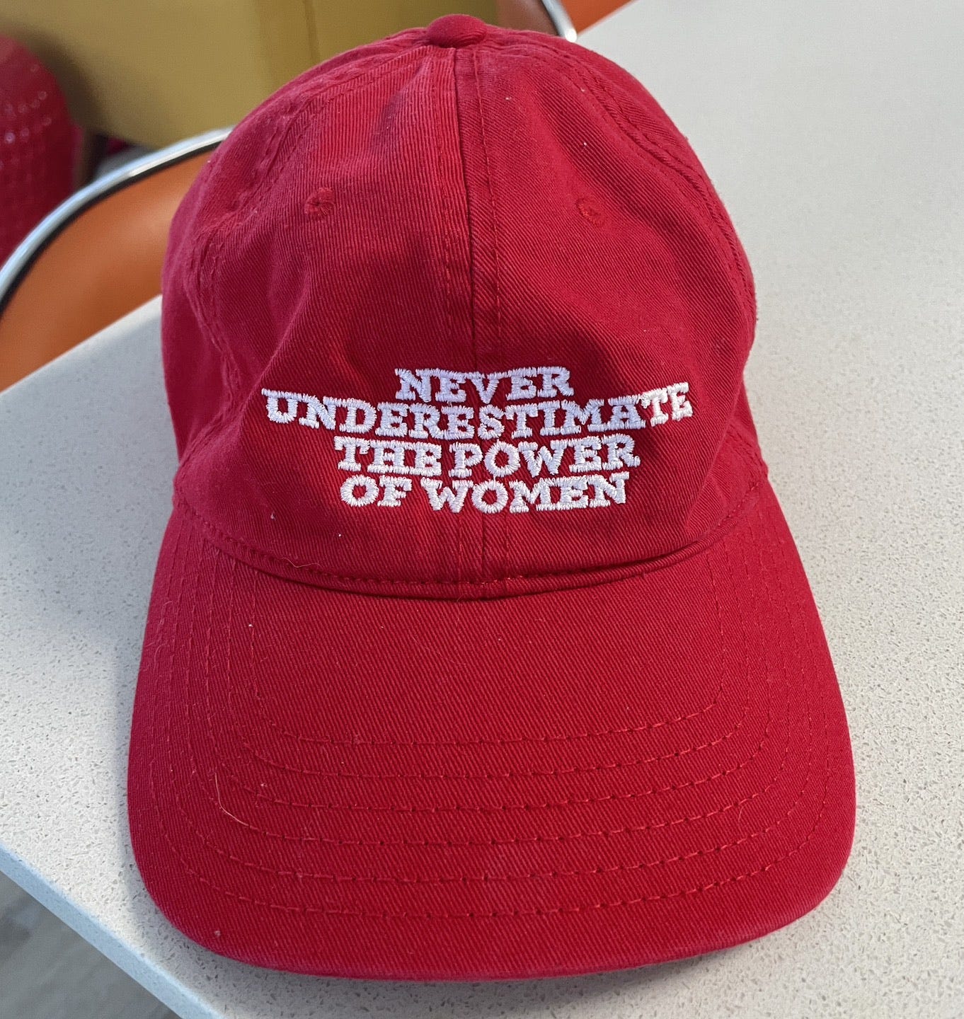
Hell, even I have a feminist red baseball cap that very well could have been made to give the middle finger to MAGA.
Now, let’s dive into the rest of the merch. The charm or downfall of official Trump merch (however you look at it) is that it’s not stylized whatsoever. Every t-shirt looks like someone just copied and pasted a Google image onto it Microsoft Paint-style.
This could be seen as tacky OR ironic, but something tells me it’s not self-aware enough to lean into purposeful irony — I can’t make that call though, as I don’t have access to the brains behind the merch operation.
This horrible t-shirt just has the illegal immigration chart pasted onto it (in very low quality). I understand that this is a nod to the assassination attempt on Trump, as I believe this chart was stated as the reason he turned his head when the bullet passed. While Gen Z humor may find this sort of fashion funny and ironic, I think this was simply made in 2 seconds and added to the store. Therefore, my ruling is that this shirt should be deported. Bye.

The website has a bunch of shirts with the image of Trump with his fist up after the assassination attempt (you know the one), as well as his mugshot.
Even though these shirts were made with the same level of sheer laziness as the chart tee, from an iconography standpoint, Republicans have been blessed with some iconic imagery in the past year or so — which makes a lot of the merch feel more organic, like they’re not grasping at straws to create something with meaning.
Trump just happens to be photographed doing wild shit that naturally translates well onto a t-shirt and his followers, naturally, eat it right up.

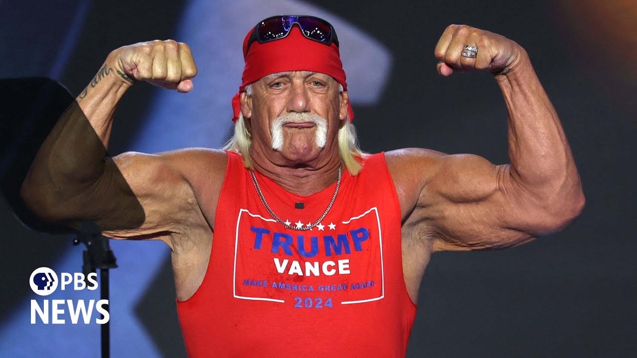
While the Trump/Vance tees are nothing to write home about, I think creating the red tank was a smart choice. It looks much more stylized and intentional than all their other shirts and the primary red paired with cobalt blue is a visually pleasing pairing.
The rest of the Trump #fashion merch consists of completely uninspired tees and hats with various “[insert group of people here] for Trump.” The fonts are a bit of a joke and the colors aren’t great. I don’t have much to say, other than it feels like they had a list of demographics and quickly spit out near-identical tees in different colorways just to cover all their bases.

Here are my rankings for Trump’s merch overall:
Iconography (8/10): From the MAGA slogan and the assassination attempt photos to the mugshot and the fact that Donald Trump has been a pop culture icon for decades, this is THE main thing Trump merch has going for it.
Consistency (6/10): While the MAGA hat is singlehandedly the most iconic piece of political fashion in recent memory, other Trump merch cannot hold a candle to this. There are way too much lackluster slogan tees and blurry graphics that feel slapped on. There are a bunch of things that are consistently bad though (LOL), so I’ll add some points for that.
Creativity (3/10): The store is about what you’d expect from generic political merch. Other than the red tank top, it doesn’t seem like anyone thought about these items from a true design/fashion perspective. The colors and font choices leave me scratching my head.
Irony (7/10): A lot of these pieces are so bad that they fall into ironically funny territory, which I’m sure was not the intention. This is an accidental win, yet a win nonetheless. There is an I Heart Trump hat in the style of the I Heart NY logo, and I think that's unintentionally hilarious and perfect.
Best Pieces of Merch: The classic red MAGA hat & red Trump/Vance tank
Worst Pieces of Merch: Latino Americans for Trump V-neck & Illegal Immigration Chart tee
Kamala Harris: Try-Hard Millenial Humor or Inspired Classics?
This is for the K-HIVE. Upon first glance at Kamala’s merch, I was extremely disappointed… that was until I realized I had accidentally only clicked “Apparel” on her website, instead of “All Collections.”
Kamala has the advantage of having the fashion industry on her side — which means merch collaborations with designers like Willy Chavarria, Vera Wang, Tory Burch, Thom Browne, and more. Pretty smart if you ask me.
The overarching theme with Kamala’s merch is that most of it looks dated — some in a good way and others in a bad way. She seems to be playing into the nostalgia of retro presidential fashion as we’ve seen with vintage-style Reagan/Bush merch, which in my opinion is a #bigbrain move. On the other hand, a significant portion of her store is comprised of dated “millennial-core” t-shirts, cringe out-of-touch imagery, and random a** words spliced together.
Let’s talk about the good stuff first.
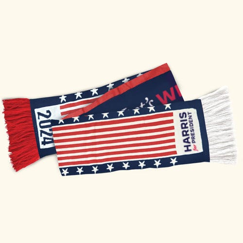
The Thom Browne scarf (by far) is the coolest piece. This just goes to show the exquisite Olympics merch/uniforms we could have gotten if they let Browne design instead of Ralph Lauren. This is what we lost. The scarf is beautiful, knit, retro, and reminds me of something Ali MacGraw would wear in the movie Love Story if she was a little flashier. That movie did for knit scarves what Clueless did for plaid. Iconic.
Again, all of the retro 70/80s style merch is great. This is a much better route to take than trying to conjure up something “hip.” The simple Kamala hat is classic and the muted colors make it palatable for everyday wear. The simple white tees and tanks are also a good choice. They’re not too flashy, the font makes sense from a design perspective, and they succeed at carrying vintage charm, while also being quite modern. All of these designs are a collab with current activists and designers, which is why these designs, in particular, seem more carefully crafted and stylized than other merch.
We must talk about the “hat heard around the world.”

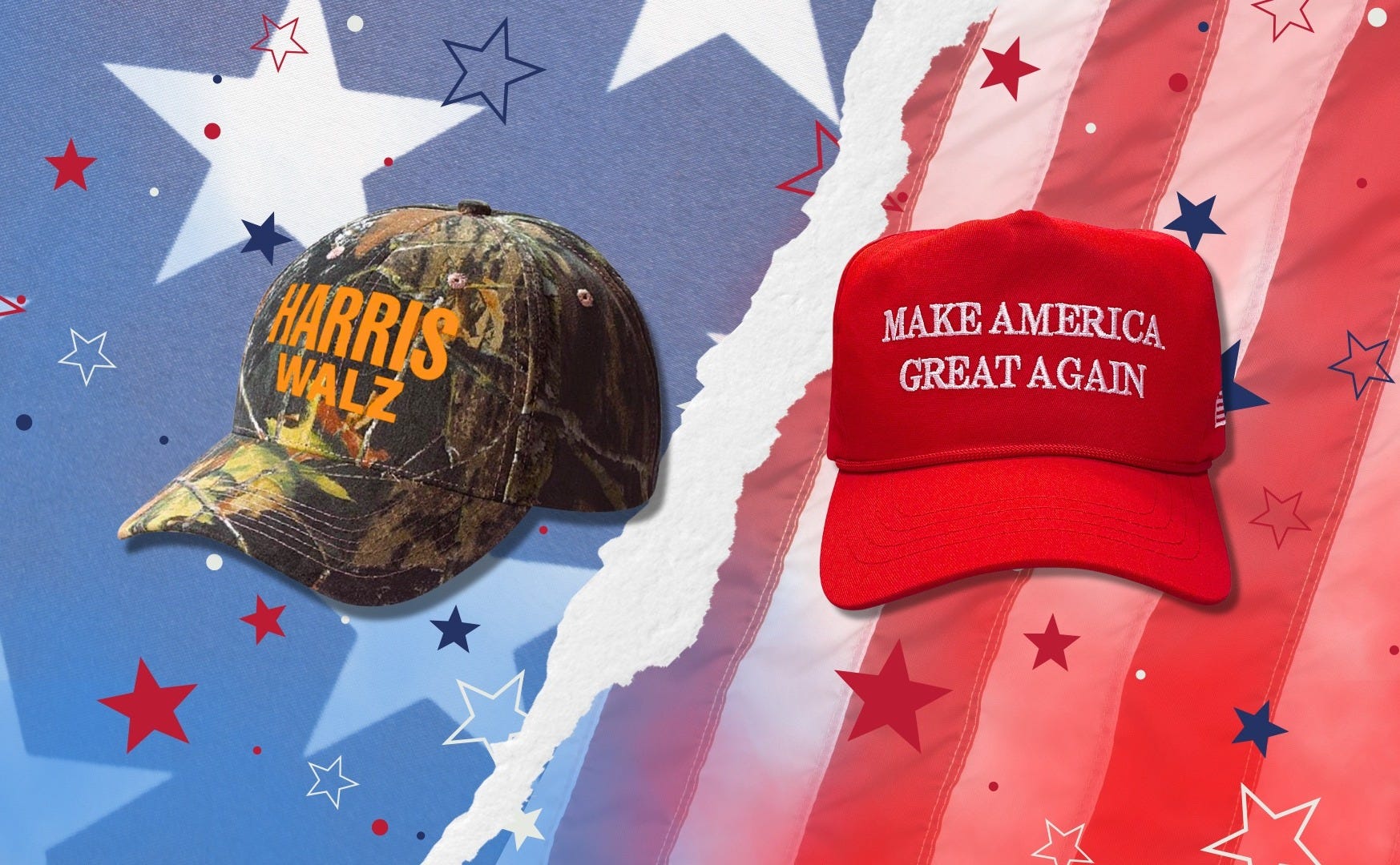
Out of all Kamala’s merch, the camo ballcap has been making the most waves. Seemingly inspired by Chappell Roan’s Midwest Princess cap (which looks almost identical), the hat sold out immediately. Gen Z culture + Y2K + the Midwest charm of running mate Tim Walz = a recipe for success. While the camo cap hasn’t yet reached MAGA-level iconic, it’s the first official political hat that could give MAGA a run for its money.
[Even Trump has a copycat camo hat on his website. Much to the surprise of no one, it looks like the Temu version of the Harris/Walz one. The camouflage is thick and bulky, unlike the more #fashionable Mossy Oak style.]
Now, let’s talk about the cringe.

Most of the floral motifs do not work. They look like something you would find at Aeropostale in 2011. I’m not sure what Jonathan Cohen was thinking with the navy sweatshirt… the color of the shirt is so dark, you can barely see the leaves. It’s completely muddled. Bad. Bad. Bad.
The ombre gear may be the most laughably horrible of the bunch… and it was shockingly created by Gabriela Hearst, a notable fashion designer and former creative director of Chloe. Both the hat and the shirt simply say “Democracy, Women’s Rights, Climate” in the most illegible font this world has ever seen. Slapping those words together on a shirt feels like a parody of Democratic values, rather than a true political statement piece. Maybe stick to one message at a time… and a less poorly blended gradient. Just saying.
Kamala’s site also features a fair bit of shirts that feature younger photos of herself or “throwbacks” of her husband Doug, to which I say… who cares? I’m sorry, but who wants to wear a shirt with Doug Emhoff on it? Snooze. It feels extremely irrelevant and I think it only makes sense in the context of the first woman president angle. There are more shirts with old photos of Kamala than there are of present-day Kamala, which I feel is a missed opportunity.
The Bi Pride and LGBTQ+ Pride shirts and mugs that feature Kamala photoshopped together in different colored suits to represent each flag are ridiculously funny. They should have done more of this.

One last piece of sheer comedy in the Kamala store is the Dark Brandon merch they have in the form of t-shirts, yard signs, color-changing mugs, and phone accessories.

However, my favorite thing about these T-shirts is that they have a photo of Jack Black wearing it on the official website to show people how to style it (of course). You can’t get more patriotic than that.

Here are my rankings for Kamala’s merch overall:
Iconography (6/10) - Kamala is lacking in the iconography department overall. I think there are a lot of missed opportunities. If she leaned into featuring her present-day self laughing on t-shirts, brat-style attire, or coconut tree merch, I think it would be seen as a positive thing from a branding standpoint. If Trump is capitalizing on every little thing, why shouldn’t Kamala? If not for the camo hat, I would have given her a 5.
Consistency (8/10) - The official, non-collab merch pieces are all pretty cohesive and look like they belong in the same collection, despite the differing subject matter. Although the Harris/Walz shirts and slogan tees are pretty basic, they all feature a similarly muted color palette that flows together nicely.
Creativity (8/10) - The designer collab aspect of the collection makes Kamala’s merch feel much more stylized and inspired than Trump’s. This is a huge plus. Although some of the designer pieces are horrendous, the good ones are VERY good.
Irony (6/10) - Again, I think there are so many missed opportunities to lean into ironically funny styles of merch, like the Bi Pride shirts. Unlike the horrible Trump merch, the bad Kamala merch doesn’t quite make its way into the category of “so bad it’s good.” It’s more cheugy than anything.
Best Pieces of Merch: Thom Browne scarf & camo hat
Worst Pieces of Merch: Ombre democracy gear
Kamala Comes Out On Top
The results are in and it seems despite having some truly sinister merchandise, Kamala Harris wins my vote. Scoring big on consistency and creativity, her clothing feels more inspired and intentional than Trump’s, and her pieces are far more stylized. I can see the overall vision even if it falls flat in some aspects.
I think the “so bad it’s good” vibe can only get you so far, and unfortunately, that is the Trump merch’s biggest appeal.
Who Do You Think Won?
I’ve blabbed enough. Now it’s time to turn the tables. What do you think?
Thanks for reading. If you enjoyed it, there is more critical commentary where that came from. A paid subscription or tip would be extremely kind and appreciated :))
That Harris/Walz camouflage hat is kind of wild.