


cherry espresso? the unexpected color combo you need on your body ASAP
i triple-dog dare you to wear red + brown.

I’ve finally pulled myself away from playing Super Mario Sunshine long enough to put virtual pen to paper for this week’s newsletter.

Granted, I had to lock my Nintendo Switch inside a lockbox and throw away the key, but that is the kind of dedication I have for keeping ‘it’s critical.’ alive and well. You. Are. Welcome.

General Musings (No One Asked For) Before We Dive In
I need an adventurous fashion writer to do a definitive ranking of every luxury/fashion brand coffee shop —from Uniqlo to Tiffany’s Blue Box Cafe. I must know which ones suck and which ones are actually advancing the plot. This is the kind of journalism we need. [If any brand/publication wants to pay for me to travel to NYC, I will happily volunteer as tribute.]
Barrel leg jeans… Hate ‘em. I’m all for a kooky silhouette, but they remind me too much of a cartoon bear (derogatory). If I want bulbous, I’d instead go all out and wear the Rick Owens balloon boots.

Reformation x Devon Lee Carlson collab is a snooze fest. They must have put every trending color into an AI clothing machine and asked them to churn out pieces “for the girls.” I’m not buying it (literally & figuratively). The world doesn’t need more butter yellow, blush pink, and baby blue… polyester.
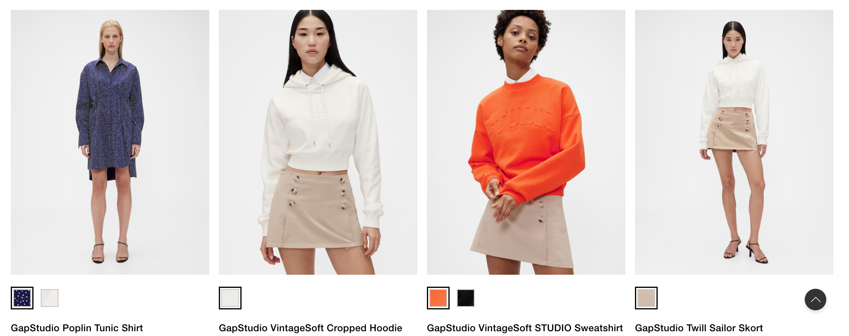
Zac Posen just debuted his first GapStudio collection—a pricier, more elevated ready-to-wear line under the Gap umbrella. And listen… I’ve genuinely enjoyed everything he’s done so far for both Gap and Old Navy. But this? It feels like a major misstep. He’s said that GapStudio was meant to feel both new and nostalgic, but the end result lands in a kind of aesthetic purgatory—somewhere between the two, but not fully committing to either.
100% agree with
when she said, “So much of it looks like it was designed for the male gaze, which is a classic ZP move, and is that going to move the needle with the Gap brand? I doubt it.”
I can appreciate the intention behind making higher-quality wardrobe staples, but the styling here just doesn’t land. Ironically, while Posen is known for dressing celebrities, he’s felt more in his element with Gap’s mainline projects—like that striped poplin two-piece or the Parker Posey campaign. Somehow, those hit the mark more than this line, which is supposed to be closer to his roots. Not mad, just disappointed.
- wrote a great piece for about all the cool stuff she bought from #regular Gap (including the famous poplin set).


I took to #notes about this one, but I hate seeing vintage sellers have a bunch of clothes in a pile where they expect people to “dig through” to find something. If this is how you treat clothes that are supposedly worth buying… I don’t want anything to do with it. It feels almost like a slap in the face as a shopper. If what you’re selling isn’t even important enough to put on display or (simply) put on a hanger (the bare minimum), why would I waste my time like a junkyard dog looking for scraps? No thanks
Ramblings done. Opinions stated. Let’s dive into the gritty stuff.

Red + Brown… Okay, Hear Me Out
The photo that started it all:
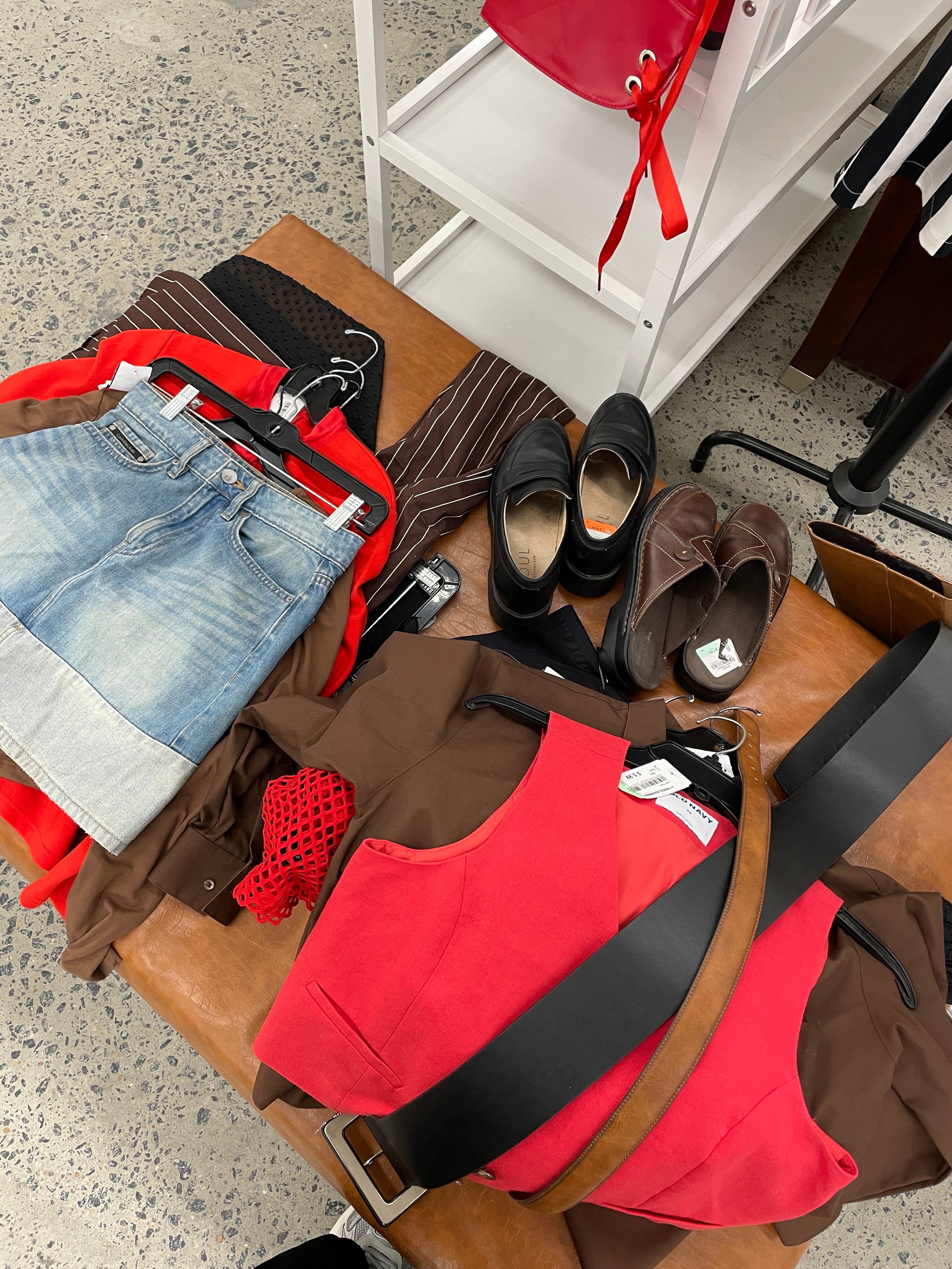
I went to my local America’s Thrift Store for a tranquil, after-work shopping sesh. After spending an hour looking through the entire store (no stone left unturned), I made my way over to the furniture section to start my “Definitely, Maybe, No” pile ritual.
[This is the part where I haul everything from my cart over to the biggest, cleanest couch I can find and start weighing the pros and cons of each piece. Since America’s Thrift Store doesn’t have fitting room mirrors, I usually wander into the furniture section and scout out a giant, ornate mirror for sale—then prop it up wherever I need it to "try things on" or at least get a decent idea of how things look. This time, though, there weren’t any mirrors available… so I made do with the reflection inside a massive armoire. Sometimes, you must get scrappy.]
Clearly, there was a common thread with everything I decided to keep. Red + brown to rule them all. The pile was too visually pleasing not to snap a photo… and thus, my obsession with this color combo was born.
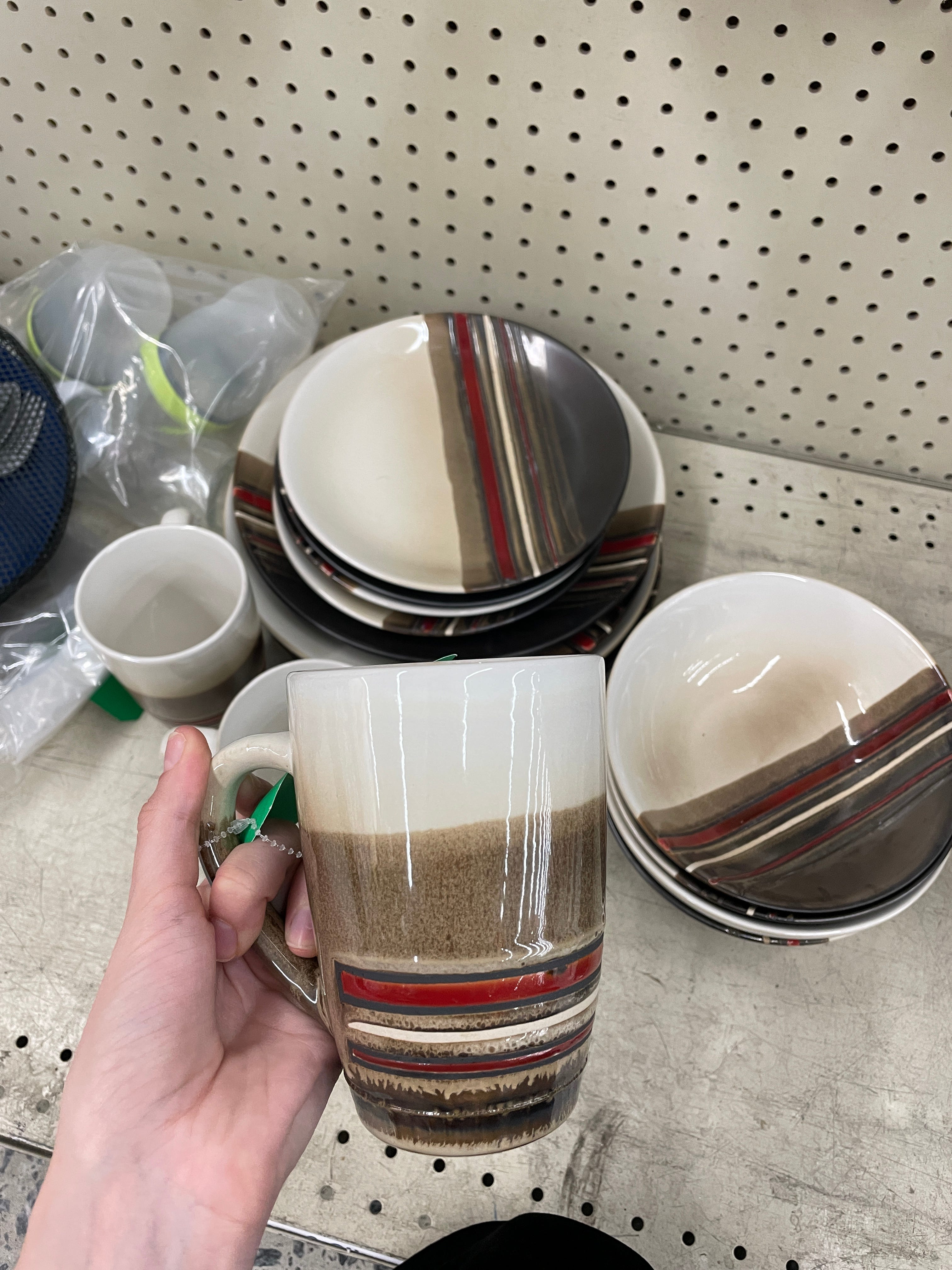
I even found some interesting red/brown dishware earlier that trip. The color wheel gods desperately wanted ME to carry out their mission.
In conclusion: Let’s get styling.

Building an Aesthetic: Candy Apple Red + Hickory Brown = ??
As you may know, I have an obsession with creating a brand for every new style aesthetic I come up with as a way to romanticize the mundane. It’s almost like I need to market it to myself to get as excited as possible about the new style journey I’m embarking on.
I started by combing through EVERY SINGLE Fall 2025 Ready-to-Wear collection that dropped this year (via Vogue Runway). In my head, I felt like this was a bigger fashion week trend, but I was dumbfounded at how few red and brown looks there actually were. The collage I made below was quite literally all I could find:
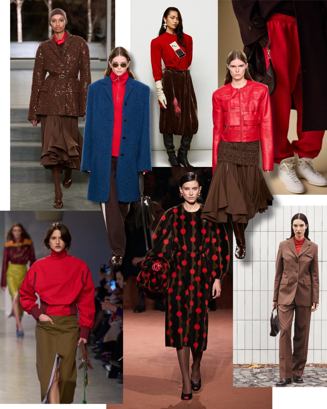
Red Sweatpants Look — Polo Ralph Lauren
Medium Brown Suit + Red Turtleneck — Nehera
Red Matchbook Sweater + Brown Velvet Skirt — Rochas
Red Backwards-esque Turtleneck + Brown Pencil Skirt — Zomer
Brown + Red Polka-dotted Sweater Dress — Fendi
Red Turtleneck + Blue Coat + Brown Sweatpants — Tory Burch
Red Leather Moto Jacket + Brown Draped Skirt — Tory Burch
Brown Belted Sequin Coat + Red Scarf — Tory Burch
If you know me, this is tough to admit… but the brand that put this particular palette on the map (this season) is Tory Burch. While I applaud the interesting color choices in their Fall 2025 collection, they are (famously) a brand I do not understand the random, newfound hype around. (That’s a newsletter for a different day.) But, I am not above giving credit where credit is due. So, claps to Tory for this victory.
[A reluctant gold star has been awarded.]
Though I was able to find some semblance of inspiration in this season’s looks, it wasn’t enough. I was hungry for more. I scoured Pinterest for casual fits, not so much to replicate anything to a T, but to find the best way to balance the two colors.
Were people going full two-toned? Breaking up the colors with pops of white? Adding black accessories? Mixing two different browns? Only having pops of red in an otherwise monochromatic look? Maybe it’s not that deep, but if my only style guidelines are two colors paired together, I want to explore every nuance.
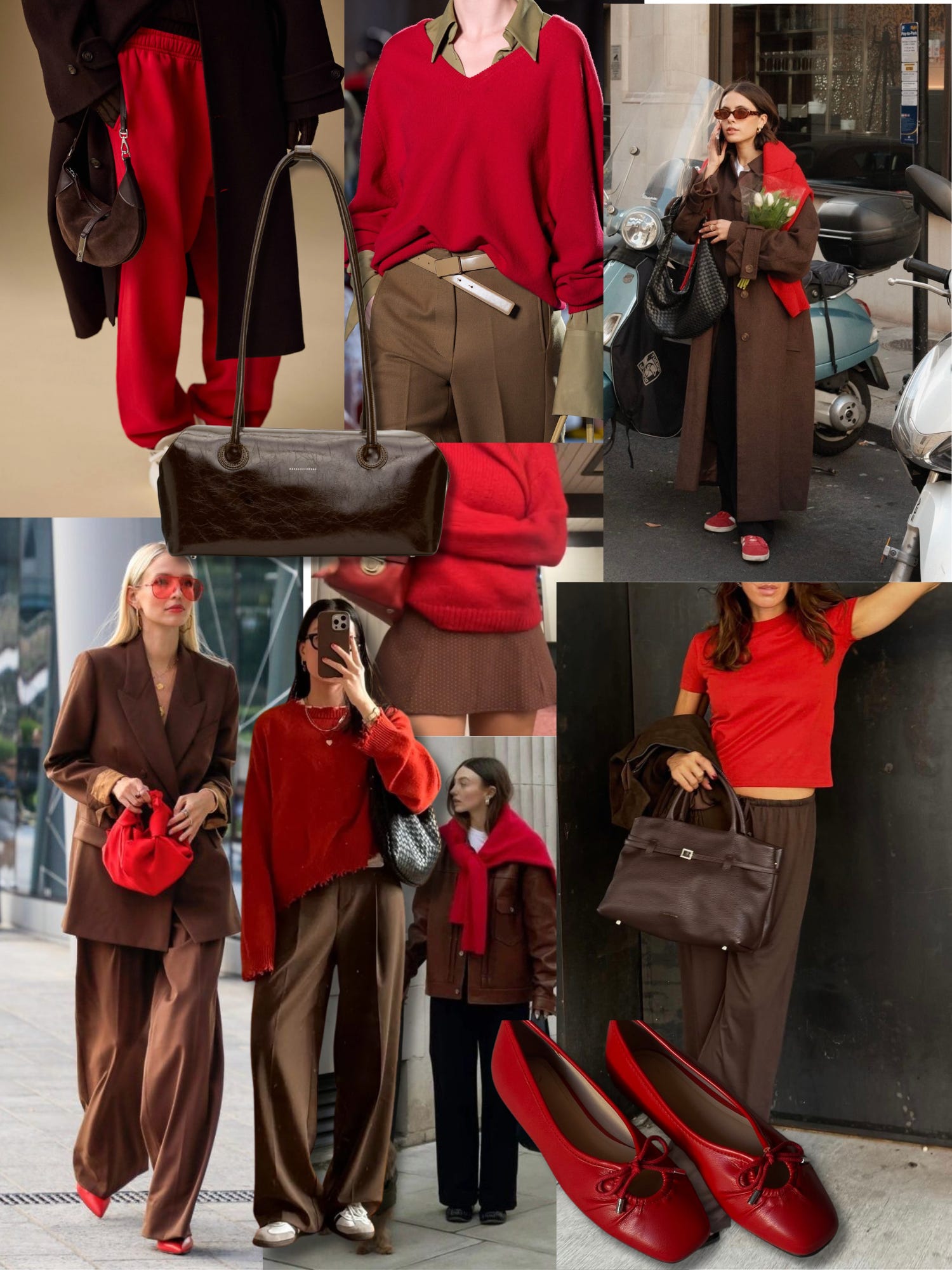
Again, not super easy to find red + brown… well anything on Pinterest. I wanted to also look at interior shots for inspiration, but it was like searching for a needle in a haystack… particularly in a situation where someone forgot to put the needle in.
Most of the looks I came across were a comfortable business casual vibe —brown loose suiting, breathable pants, red sweaters, sneakers. This feels exceptionally fitting for the current trend cycle, as we continue to live in a world where dressing up sweatpants is THE ultimate style test for true fashion girls.
While researching for this newsletter, I did see this *timely* mirror pic from heyhialyssa on Instagram that I thought was beautifully styled.
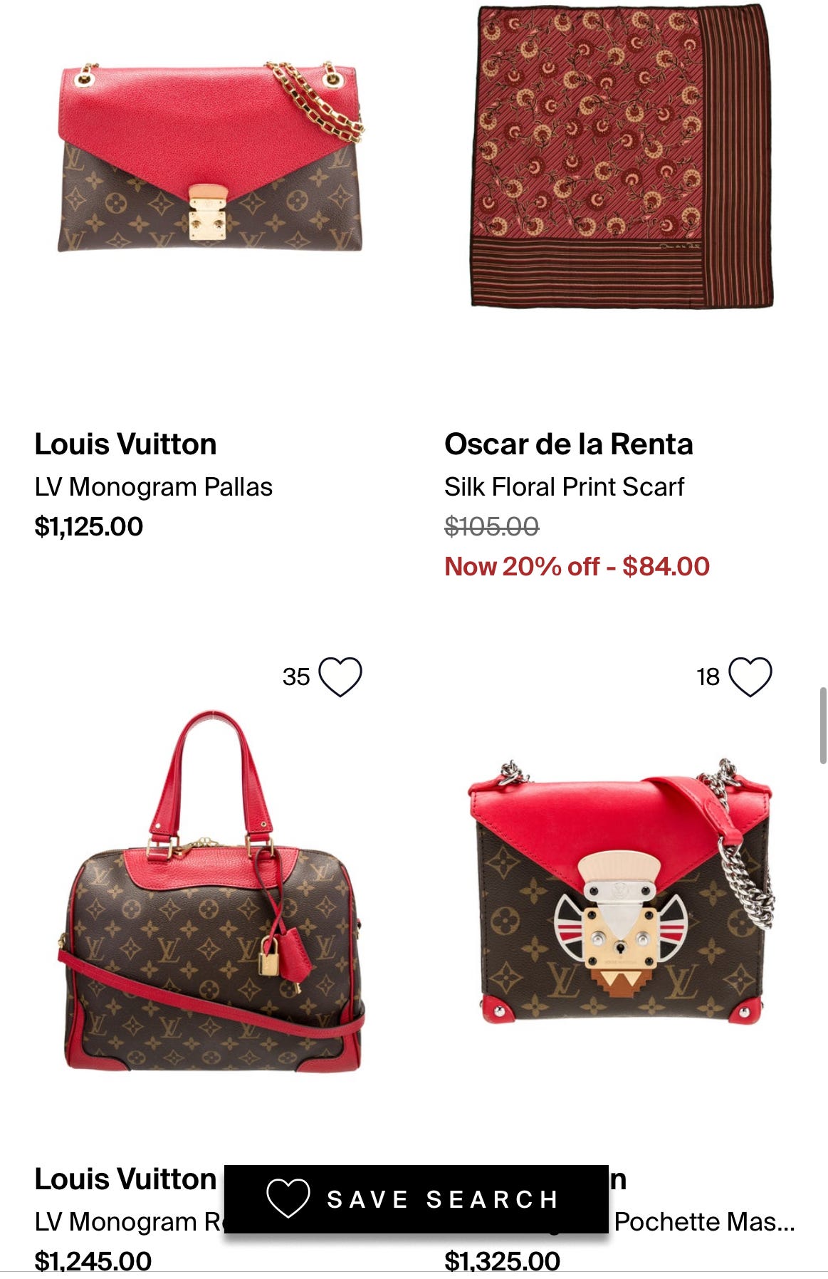
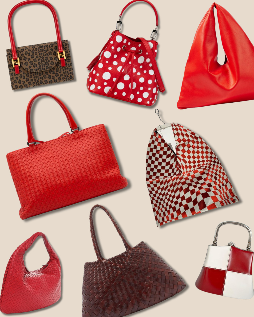
The ugly side of red + brown? It does exist… in the form of Louis Vuitton bags. This is a dangerous territory to be in, if you’re considering this color combo. Who knew an LV monogram could turn something once warm & earthy into a red hot eye sore?
I gently advise against incorporating this into your closet. And if you already own one… the good news is, they clearly have decent resale value...!

What’s in a Name?
Now, for the fun part. Every aesthetic needs a name. Here are some of the ones I came up with during my personal brainstorming session:
Cherry Espresso
Strawberry Mocha
George Washington’s Cherry Tree
Cinnamon Kiss
Red Hot American Dirt (personal fav)
Mars Bar
Volcano Blast
Cranberry Soda
Red Velvet: Before & After
Cardinal on a Branch
Grumpy Chic
[Let me know which one is your favorite!!]

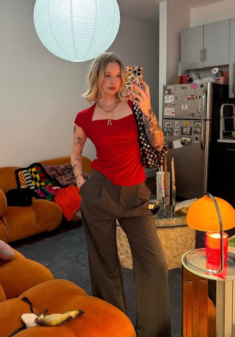
From Pinterest to… My Dirty Mirror: Styling Cherry Espresso
Listen, I’m not a stylist by any stretch of the imagination. But I wanted to try my hand at putting together some red + brown outfits to showcase the endless possibilities… or something like that.
I’m Working Late, Cuz I’m a Leopard
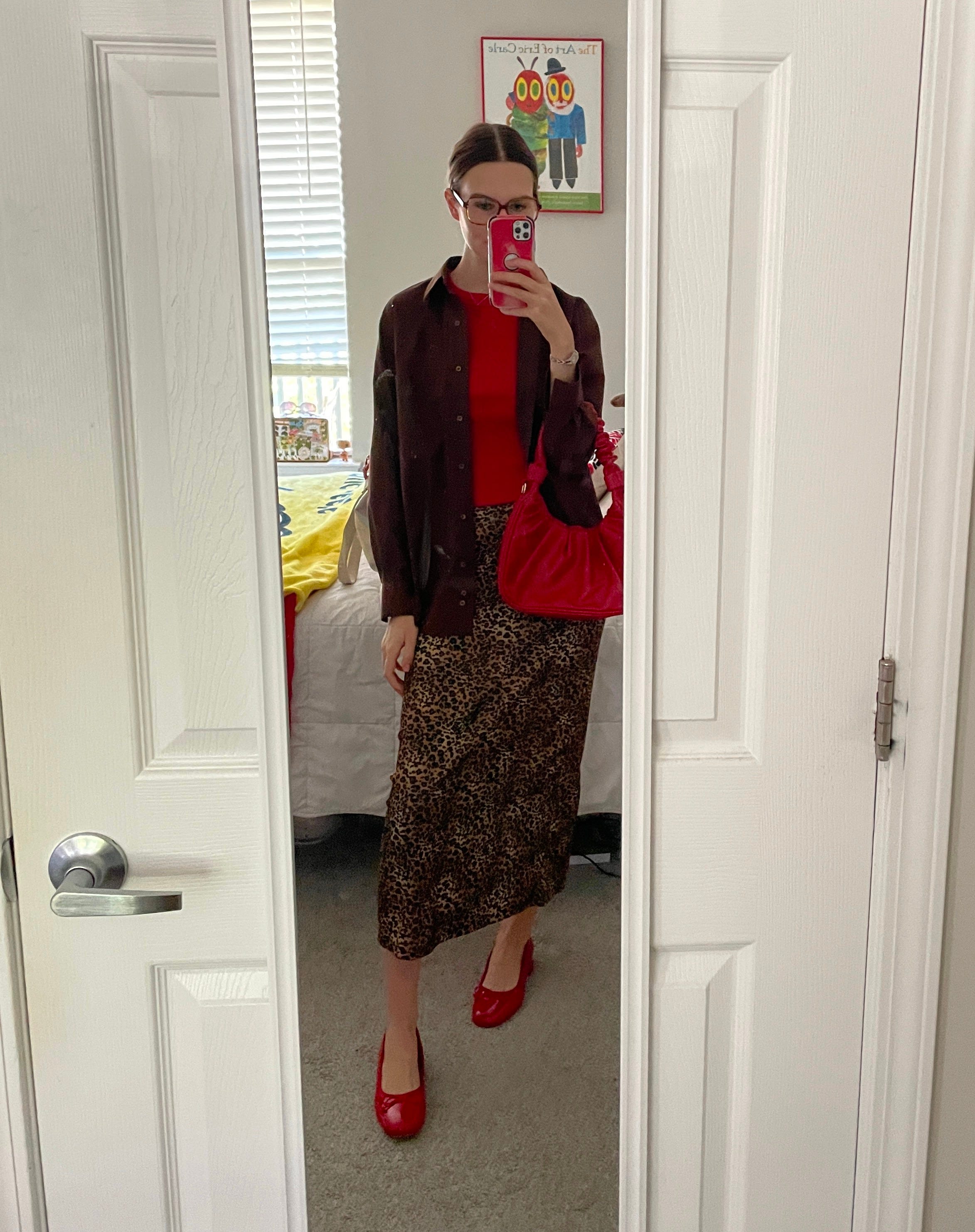
If you wear a cute outfit to the office and no one is around to see it… did it really happen? No, so I took pictures.
I wore this fit last week, because I wanted to challenge myself to try out red and brown paired with a print. All the inspo pics I found were mostly straight color blocking, but I thought a leopard midi would be the perfect statement piece to build around. I like how balanced this look turned out. The outfit math was math-ing for this one. I’d definitely wear it again.
Sailor Moon Volcano??
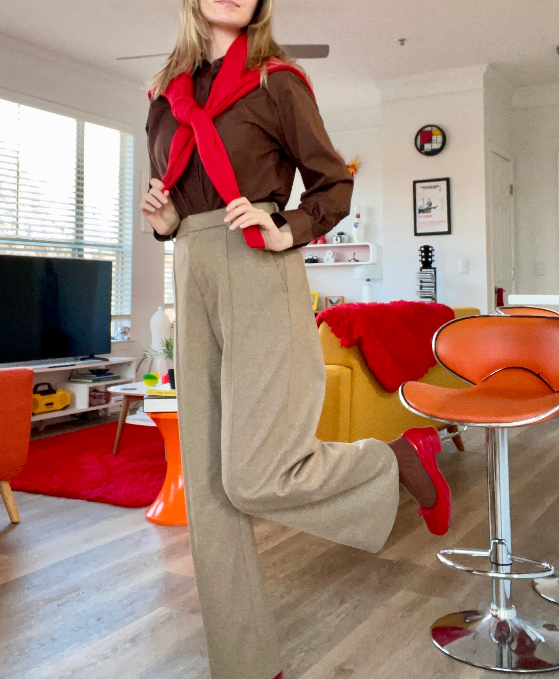
I’ll never understand how everyone (on the internet) looks cute with a sweater around their shoulders, because when I try it, it feels like a bulky cosplayer. Anyways, I wanted to test out a brown sock + a prominent intermediate color. I think it’s “okay,” but there is too much sandy/light brown going on that overpowers everything.
Red Sweater —Vintage Thrifted
Brown Button Up —Thrifted
Feisty 90s School Teacher
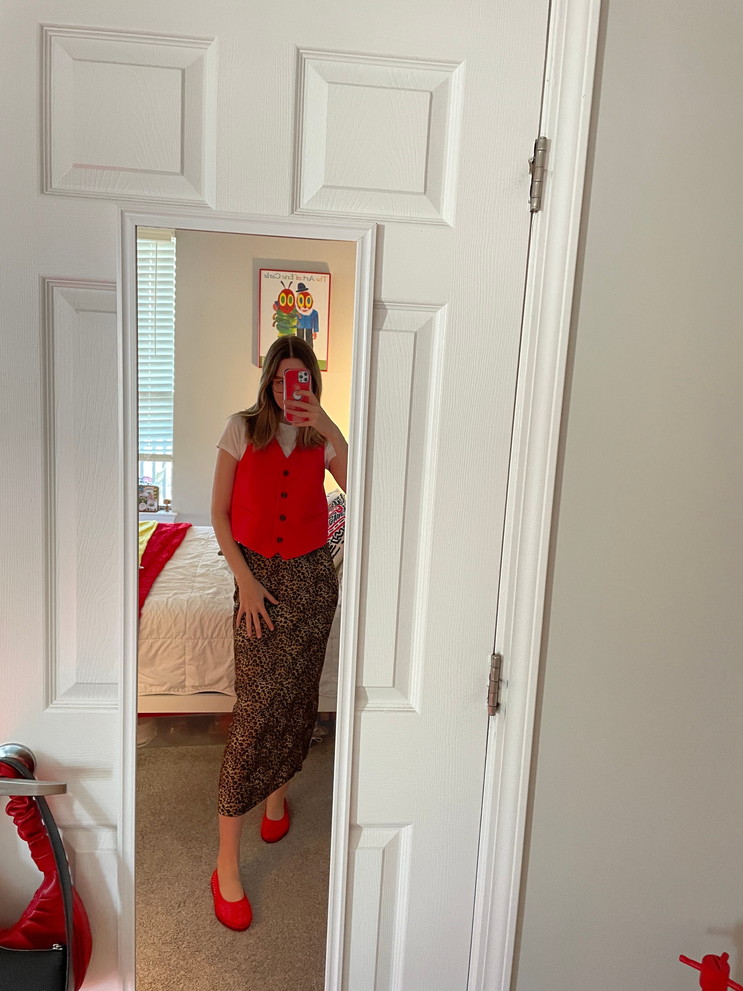
Another leopard skirt fit, but this time with the thrifted Old Navy vest I found. I still wanted that pop of red, but with some white up top —balanced out with a red jelly/mesh flat. The 90s called… they want their 3rd grade teacher back! I think it’s cute. It’s simple. Not sure it’s my style (per say), but it works as… clothes on my body.
Leopard Skirt —Thrifted
Old Navy Vest —Thrifted
Basic Color Blocking (Strawberry S’mores 4 Ever)
I dabbled with the white tee in the previous outfit, but I wanted to see it play a bigger role. What if the red + brown was completely balanced with a third neutral? This is kind of an incomplete, basic guideline and could be spruced up with accessories. I think adding a pop of red necklace, a white pump, and printed/textured bag could take it from blueprint to elevated work fit.
Woodland Creature // Cottage Core
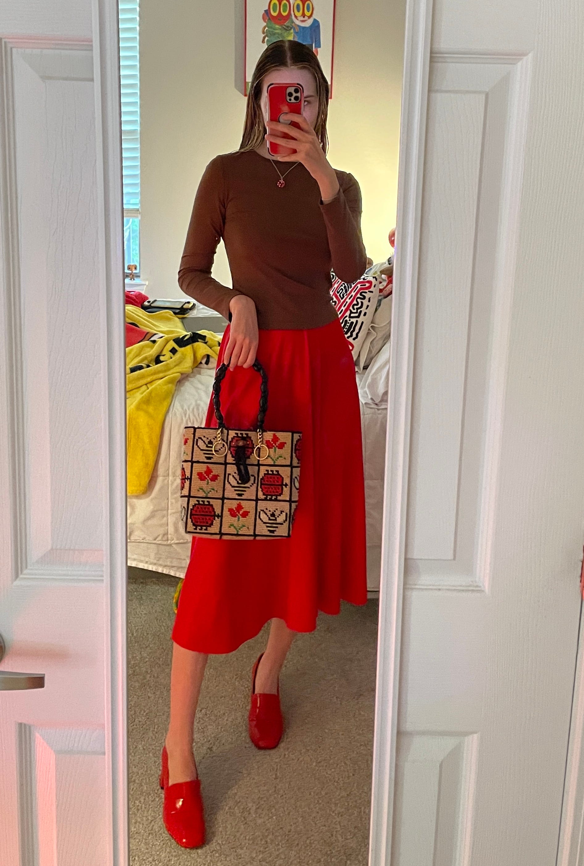
This fit is like if one of the animals from Snow White was turned into a human. I wanted to create a feminine outfit where red was the “star of the show.” I started by color blocking with the brown + red, and slowly started to incorporate accessories that tied it all together — the red dice necklace, needlepoint bag, accidental phone case matching. I’ve been loving midi skirts lately, so this was a pretty topical fit for me, although maybe more girly than I’m used to!
[Everything in this outfit is thrifted/unbranded except for the shoes which are secondhand M.Gemi heeled loafers I found at Goodwill.]
Micro Mini Shorts are Still Cool…ing
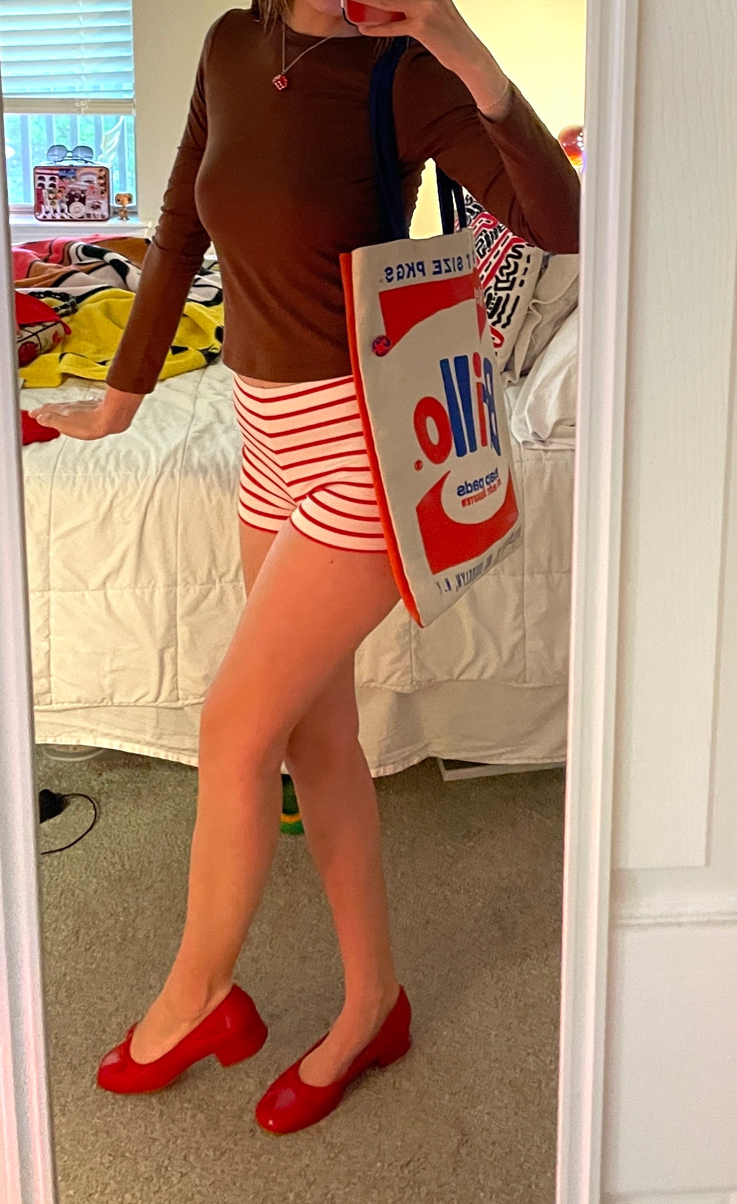
Other than the first leopard skirt look, this one feels the most me. Ever since last summer, I have been super into micro mini shorts. The Atlanta temps are unbearable in June/July, so if I don’t want to die of a heat stroke simply walking out to my car… the formula is often: as little pant as possible.
I took this picture before my AMAZING brown tank from Uniqlo came in, so I would probably pair that with the shorts for maximum… coolness (literally not figuratively).
With the little ballet heels & the striped micro mini shorts, I got a 60s beach vibe, so I thought the Brillo tote screamed effortless, “just throw everything in a bag and go.”

I hope this newsletter inspires you to branch out, get inspiration from unexpected places/unexpected color combos, and play dress up in your closet! If Pinterest doesn’t have enough reference photos, you know you’re doing something right/unique to you. Cheers!
📢 Call for Graphic Designers 📢
Hi, dear readers. I’m looking to amp up the branding for ‘it’s critical.’ —create some additional logos, branded headers, & various visual materials! If you are a graphic designer or know someone who would be interested in collab-ing with me to make some cool stuff, shoot me an email at:
emileerussell1998@gmail.com
Thanks!
I’m a fan of Grumpy Chic 🤠❣️
I love a newsletter that offers some REAL fashion critiques, fashion inspo AND makes me laugh (the needle in a haystack line was hilarious). I think you've hit the nail on the head with Cherry Espresso. I loved reading about a colour-combo that isn't completely oversaturated on Pinterest!